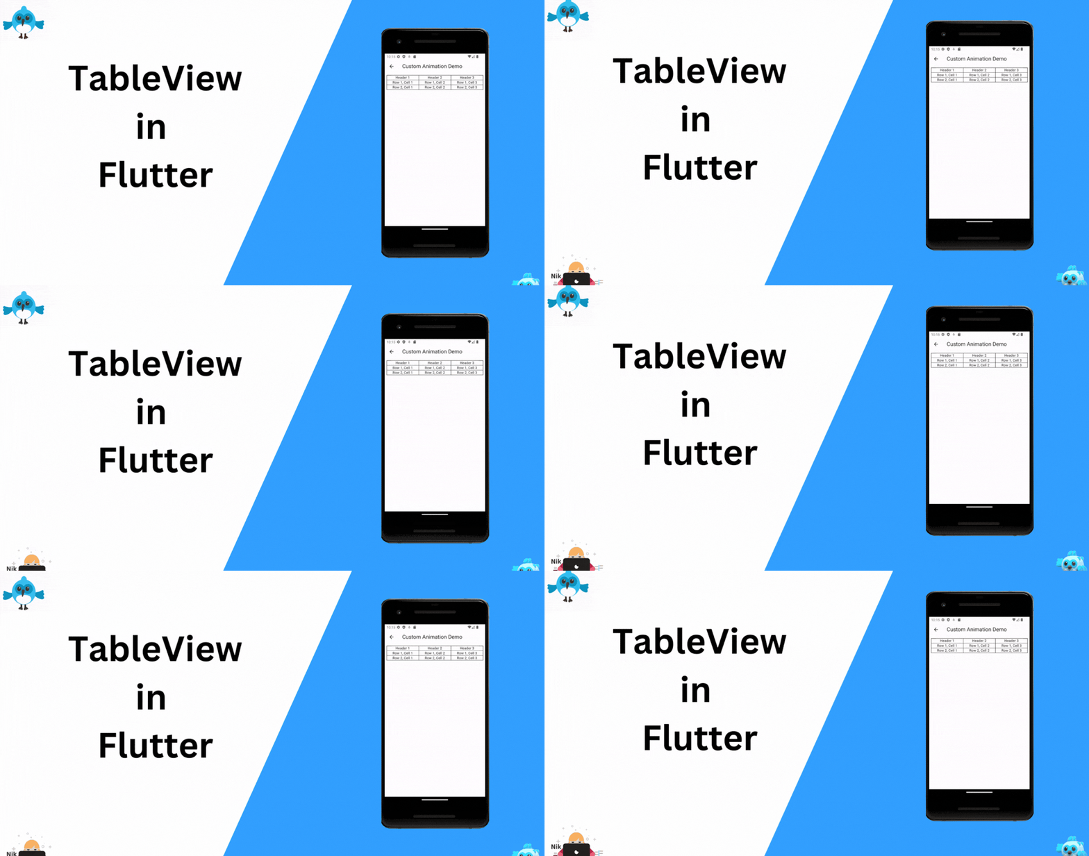
Mastering Structured Layouts with Flutter’s Table Widget: A Comprehensive Guide
Flutter, Google’s UI toolkit for building natively compiled applications for mobile, web, and desktop from a single codebase, offers a rich set of widgets for crafting sophisticated and user-friendly interfaces. Among these, the Table widget stands out as a powerful tool for creating structured layouts that organize content into rows and columns. In this blog post, we'll dive into the world of Table widgets in Flutter and learn how to create well-organized and responsive layouts.
Understanding the Table Widget:
The Table widget in Flutter provides a way to organize content in a grid-like format. It allows you to arrange widgets into rows and columns, making it ideal for displaying tabular data, pricing tables, schedules, and more. The Table the widget works in conjunction with TableRow and TableCell widgets, providing a flexible and efficient way to achieve complex layouts.
Creating a Basic Table:
To create a basic table layout, follow these steps:
1. Import the necessary Flutter libraries:
import 'package:flutter/material.dart';
2. Define your table using the Table widget and its associated children:
import 'package:flutter/material.dart';

class TableScreen extends StatefulWidget {
  const TableScreen({super.key});

  @override
  State<TableScreen> createState() => _TableScreenState();
}

class _TableScreenState extends State<TableScreen> {
  @override
  void initState() {
    super.initState();
  }

  @override
  void dispose() {
    super.dispose();
  }

  @override
  Widget build(BuildContext context) {
    return Scaffold(
      appBar: AppBar(
        title: const Text('Custom Animation Demo'),
      ),
      body: Padding(
        padding: const EdgeInsets.all(8.0),
        child: Table(
          border: TableBorder.all(), // Add borders to cells
          children: const [
            TableRow(
              children: [
                TableCell(child: Center(child: Text('Header 1'))),
                TableCell(child: Center(child: Text('Header 2'))),
                TableCell(child: Center(child: Text('Header 3'))),
              ],
            ),
            TableRow(
              children: [
                TableCell(child: Center(child: Text('Row 1, Cell 1'))),
                TableCell(child: Center(child: Text('Row 1, Cell 2'))),
                TableCell(child: Center(child: Text('Row 1, Cell 3'))),
              ],
            ),
            TableRow(
              children: [
                TableCell(child: Center(child: Text('Row 2, Cell 1'))),
                TableCell(child: Center(child: Text('Row 2, Cell 2'))),
                TableCell(child: Center(child: Text('Row 2, Cell 3'))),
              ],
            ),
          ],
        ),
      ),
    );
  }
}
Customizing the Table:
The Table widget offers various properties for customization. You can adjust the appearance of the cells using properties like border, defaultColumnWidth, and more. You can also use TableColumnWidth to specify custom widths for columns.
Responsive Design:
Flutter’s Table widget is responsive by default. It adjusts its layout based on available screen space. However, keep in mind that tables can become challenging to read on smaller screens due to limited space. In such cases, consider alternative layouts or use breakpoints to adapt the table's presentation.
When to Use Tables:
The Table widget is a powerful tool for creating organized layouts, but it's important to use it judiciously. Tables are best suited for displaying structured data that benefits from a grid-like presentation. Avoid using tables for general page layouts or excessive nesting, as this can hinder the flexibility of your UI.
Conclusion:
The Table widget in Flutter provides an effective way to create organized layouts with rows and columns. Whether you're building a pricing comparison table or displaying complex data, the Table widget offers the flexibility and control needed for crafting user-friendly interfaces. By understanding its features and customizing its behavior, you can leverage the power of the Table widget to enhance your Flutter applications with elegant and organized layouts.
Incorporating the Table widget into your Flutter projects can significantly improve the organization and presentation of your content. Whether you're creating a dashboard, a schedule, or a data-rich application, the Table widget can help you achieve a visually appealing and structured user interface.