Creating Expandable and Collapsible UIs with Flutter’s ExpansionPanelList: A Practical Guide with Code Examples

Introduction
User interfaces allowing users to expand and collapse content sections provide an organized and user-friendly experience. Flutter’s ExpansionPanelList widget is the perfect tool for achieving this functionality. In this blog post, we'll explore how to effectively use the ExpansionPanelList widget to build interactive and collapsible UIs in your Flutter applications, complete with practical code examples.
Getting Started: Basic Implementation
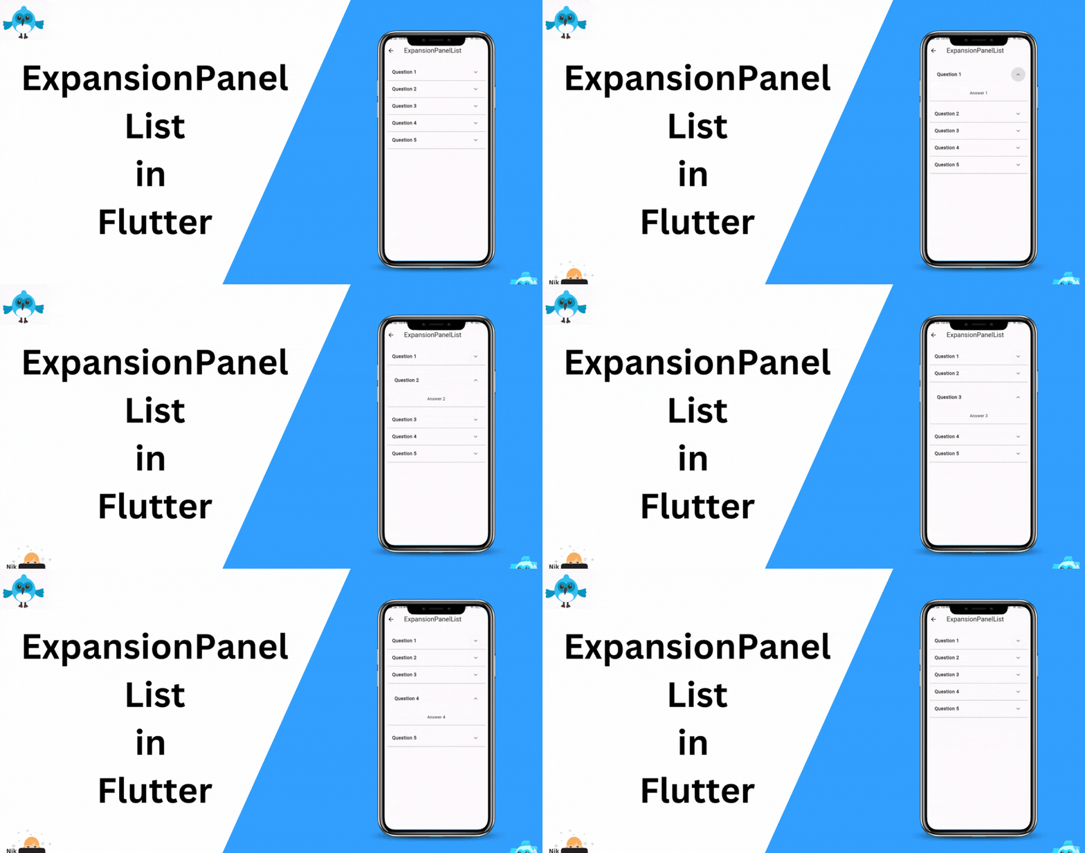
Let’s start by creating a basic ExpansionPanelList with static content. Suppose we want to display a list of frequently asked questions (FAQs) that users can expand to view answers.
import 'package:flutter/material.dart';

class ExpansionPanelListScreen extends StatefulWidget {
  const ExpansionPanelListScreen({super.key});

  @override
  State<ExpansionPanelListScreen> createState() => _ExpansionPanelListState();
}

class _ExpansionPanelListState extends State<ExpansionPanelListScreen> {
  List<Item> _data = [];

  @override
  void initState() {
    super.initState();
    _data = generateItems(5);
  }

  @override
  Widget build(BuildContext context) {
    return Scaffold(
      appBar: AppBar(
        title: const Text('ExpansionPanelList'),
      ),
      body: SingleChildScrollView(
        child: Container(
          margin: const EdgeInsets.all(16.0),
          child: _buildPanel(),
        ),
      ),
    );
  }

  List<Item> generateItems(int numberOfItems) {
    return List<Item>.generate(numberOfItems, (int index) {
      return Item(
        headerValue: 'Question ${index + 1}',
        expandedValue: 'Answer ${index + 1}',
      );
    });
  }

  Widget _buildPanel() {
    return ExpansionPanelList(
      expansionCallback: (int index, bool isExpanded) {
        setState(() {
          _data[index].isExpanded = !isExpanded;
        });
      },
      children: _data.map<ExpansionPanel>((Item item) {
        return ExpansionPanel(
          headerBuilder: (BuildContext context, bool isExpanded) {
            return ListTile(
              title: Text(item.headerValue),
            );
          },
          body: ListTile(
            title: Text(item.expandedValue),
          ),
          isExpanded: item.isExpanded,
        );
      }).toList(),
    );
  }
}

class Item {
  Item({
    required this.expandedValue,
    required this.headerValue,
    this.isExpanded = false,
  });

  String expandedValue;
  String headerValue;
  bool isExpanded;
}
In this example, we’re using a ExpansionPanelList to display a list of FAQs. Users can tap on a question to expand and view the answer. The state of each panel is managed using the isExpanded property.
Customizing Panel Content and Styling
You can customize the appearance of the header and body of each panel to match your app’s design. Use headerBuilder and body properties to define custom widgets for these sections. Additionally, you can style the panels using themes.
// Inside _buildPanel()
return ExpansionPanelList(
  expansionCallback: (int index, bool isExpanded) {
    setState(() {
      _data[index].isExpanded = !isExpanded;
    });
  },
  elevation: 2, // Panel elevation
  expandedHeaderPadding: EdgeInsets.all(8.0), // Padding for expanded header
  dividerColor: Colors.grey, // Divider color between panels
  children: _data.map<ExpansionPanel>((Item item) {
    return ExpansionPanel(
      headerBuilder: (BuildContext context, bool isExpanded) {
        return ListTile(
          title: Text(
            item.headerValue,
            style: TextStyle(fontWeight: FontWeight.bold),
          ),
        );
      },
      body: Padding(
        padding: EdgeInsets.all(16.0),
        child: Text(item.expandedValue),
      ),
      isExpanded: item.isExpanded,
    );
  }).toList(),
);
Conclusion
Flutter’s ExpansionPanelList widget is a powerful tool for creating collapsible and interactive user interfaces. By mastering its usage and applying customization techniques, you can build dynamic and user-friendly UIs in your Flutter apps. The provided code examples serve as a starting point for creating your own expandable and collapsible content sections. With this knowledge in hand, you can enhance your app's usability and provide a seamless user experience.